Look how the Xbox home screens could be with these well-defined concepts.
More stories in the category Multimedia
- Bungie shows character Rook in a new cinematic trailer for Marathon
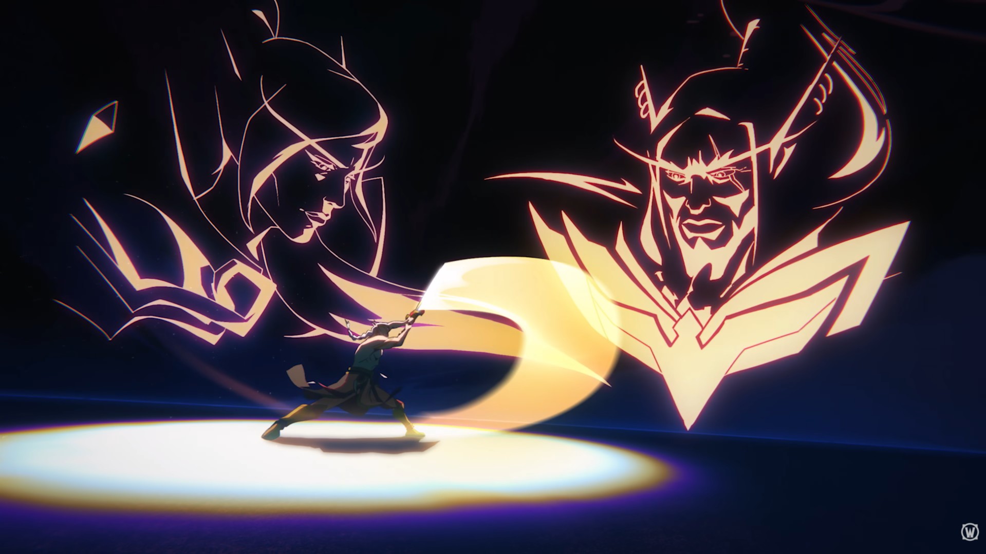
- Arator is the protagonist of the new animated trailer of World of Warcraft: Midnight
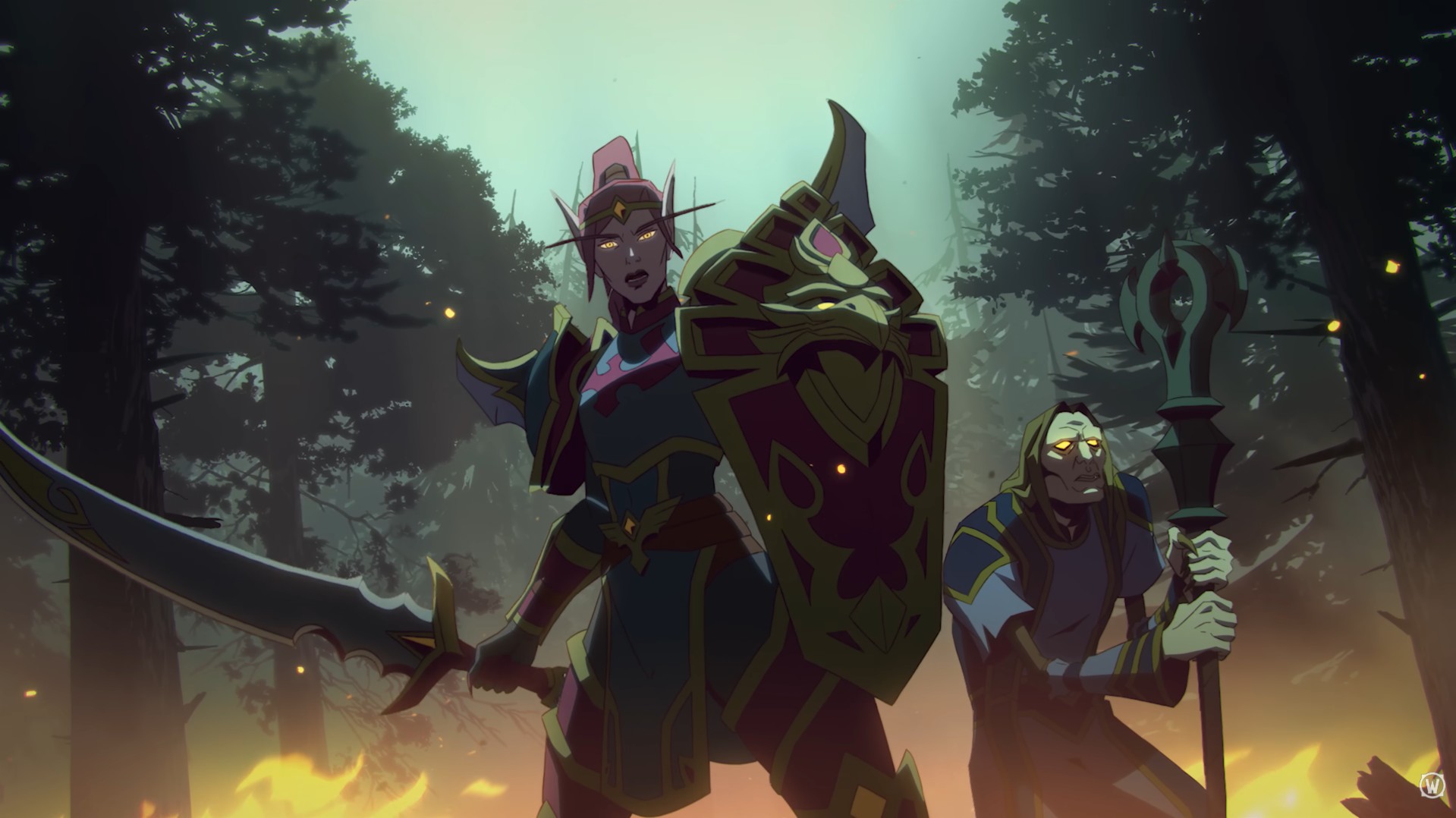
- The elf Liadrin is the protagonist of the new animated trailer of World of Warcraft: Midnight
| Don't miss anything and follow us on Google News! |
From the launch of Xbox One in 2013 to the present day, we’ve had numerous home screens on the console. Since its arrival, it would be complicated to summarize all the interfaces we’ve seen, as well as the changes that have been made, whether major or minor.
The truth is that the latest ones have been refining and hitting the right note, although at least for me, I still consider that they have room for improvement and could be refined even more. That’s why we bring you these concepts created by a Reddit user to transform the interface of the current Xbox or future ones, with a much more minimalist style and advancing, I personally liked them, but I’d like to know what you think and what you think of the current one.
Redesigning the Xbox interface with these results
You can scroll through the images one by one to see what you think of these concepts created by this user and we’d love to hear your opinion.

Founder and editor of SoloXboxOne and Generación Xbox. He is also one of the owners of the GX Group, Samsung Universe and the Reflotes forum. Adrian has reviewed over 200 games on the web and has an average score of 85 according to Opencritic. Among his expertise as a writer and analyst, he has interviewed Microsoft personalities and participated in private gaming events.
Related Post