Microsoft begins to update the shopping experience in the Xbox App with animations and effects reminiscent of the console.
More stories in the category PC
- Get to close the week 4 new free games of Steam
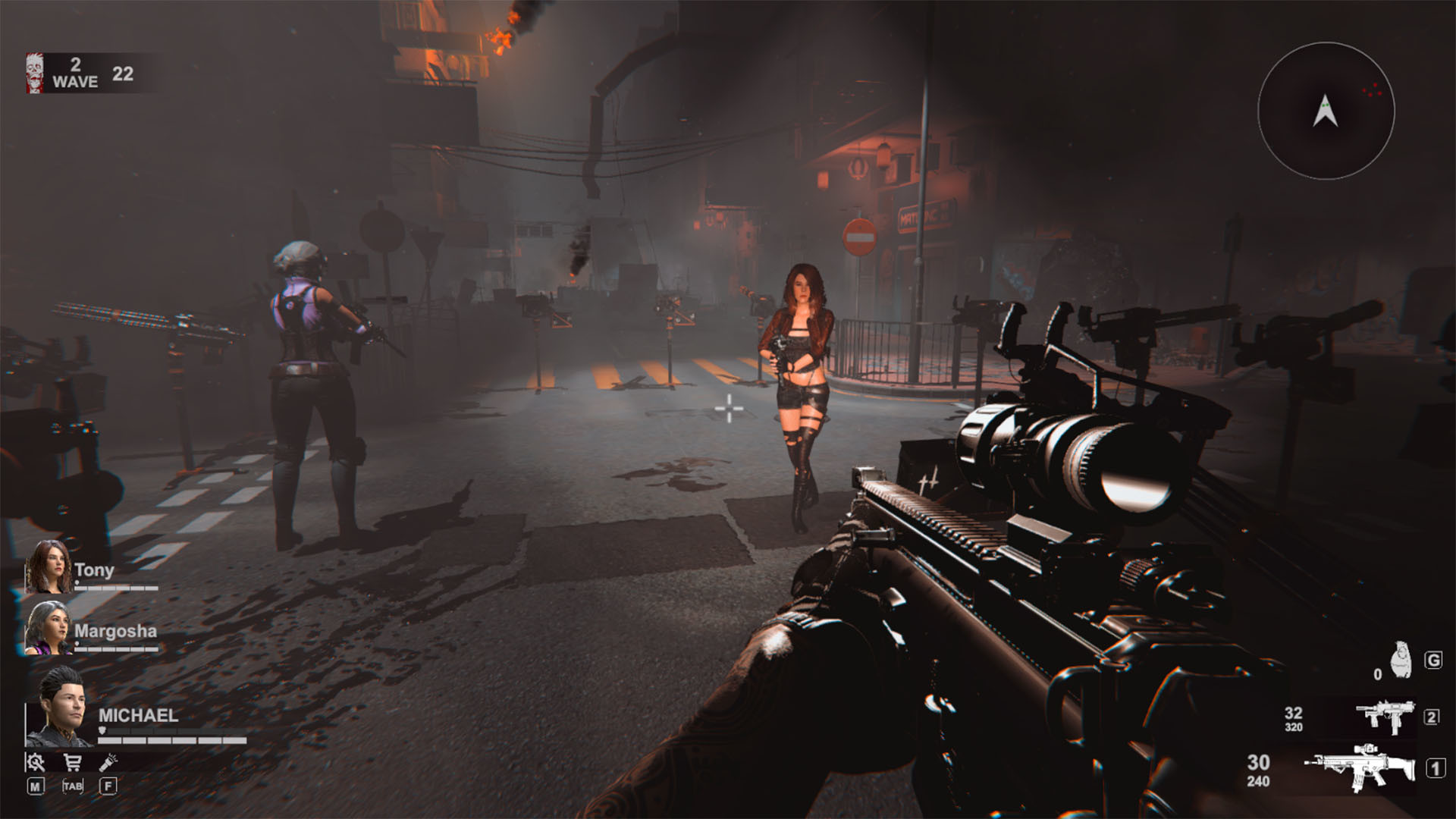
- Get it for free on PC, Blood And Zombies (you save 14 euros)
- The Epic Games Store gives away another surprise game for 24 hours: download now
| Don't miss anything and follow us on Google News! |
The Xbox for PC application continues to evolve gradually, and the latest update brings a change that users have been requesting for a long time: a more fluid interface and the characteristic Xbox selection sound when buying games.
Several players have detected this novelty when accessing the purchase process within the app, where smoother animations, clean transitions, and a more console-like feel are now displayed, something that many see as the first step towards a complete renovation of the PC experience.
A more polished interface, with room for improvement
The Xbox community on PC has been asking for months for the application to have the same level of fluidity as the console or the Xbox Cloud Gaming web portal, and this change points precisely in that direction.
For now, the improvements are limited to the moment of making a purchase, but the redesign incorporates visual and sound elements from the Xbox ecosystem, giving a hint of the direction the company could take: a unified experience between console, PC, and cloud.
| Visible change | What improvement does it bring |
|---|---|
| Smoother animations | The transition between purchase menus is more fluid and modern. |
| Classic selection sound | The characteristic Xbox “click” returns to the app, adding identity. |
| New payment interface | Clearer and more consistent design with the Xbox Store on console. |
| Better integration with Game Pass | Games included show their status with more visible icons. |
Although reactions are mixed (some celebrate the improvement, others recall that the application “still needs a total overhaul”), the change demonstrates that Microsoft is prioritizing the commercial part of the app, reinforcing the visibility of direct purchases within the ecosystem.
If this design is finally extended to the rest of the interface, the Xbox App for PC could finally approach the console experience, combining style, fluidity, and more coherent navigation with the rest of the Xbox ecosystem.
Here you can see it in action
Alternatively, you can check out this Reddit post: The Xbox pc app has a new interface when buying games with better animations and the xbox select sound.

Lover of videogames, Xbox, Halo and Gears of War.
Related Post