Players want a more functional and less commercial home screen.
More stories in the category News
- Call of Duty 2026 could return to October with a new Modern Warfare and would not compete with GTA 6
- Crimson Desert under the microscope on Xbox: Digital Foundry approves Xbox Series X but not Xbox Series S for these things
- Is GTA 6 expensive, the price continues to generate debate among players
| Don't miss anything and follow us on Google News! |
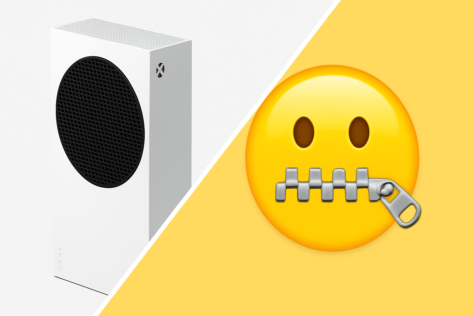
With the arrival of the latest system updates, many Xbox Series and Xbox One users have expressed their discontent with the new main menu layout. Specifically, the complaint centers on the bottom row of the home screen, where Microsoft displays promotions, discounts, or advertising campaigns for games and services.
In a highly commented thread on social media, numerous players are asking the company to offer an option to hide this section, arguing that it takes up unnecessary space and disrupts the visual cleanliness of the panel. “I can already access the store from the top icon, I don’t need another row of ads that just turns the menu into a billboard,” notes one of the most upvoted messages.
The community is calling on Microsoft for more customization options on the home screen
Although Microsoft has not made an official statement, the discussion has gone viral among users who are demanding greater customization of the interface. Many suggest replacing that row with more useful elements, such as the list of connected friends, the latest saved clips, or direct access to Game Pass.
The debate reflects a shared sentiment in the community: the desire for a cleaner, more fluid, and more personalized experience, without intrusive ads or suggestions. Some even joke that, “to get rid of ads, you’ll have to pay a supplement.”
The company has been adjusting the menu design in recent years, prioritizing quick access to Game Pass and the store, but this new controversy shows that players are still asking for something simple: a more functional and less commercial interface.

Lover of videogames, Xbox, Halo and Gears of War.
Related Post